Dirty Sweep: The Restless Work of Lauren Schaffer
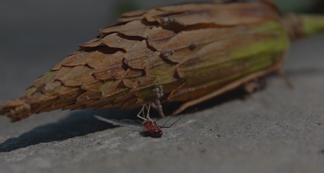
Lauren Schaffer screenshot from Studio Series: what there is of me on the glass
Less than twelve paces from Toronto Artist, Lauren Schaffer’s kitchen door lies the entrance to her studio backing onto an alleyway at the end of the yard. The two portals bookend this brief passage through the outdoors with its microbes and leaf mold, its insect and animal life—stations of the day and seasons. One of the doors marks the threshold to the familial and domestic routine while the other opens onto the discipline and solitude of artistic practice. Over the past several years, Schaffer’s traversal along this circuit with its infra-thin natural barrier has provided much fodder for her work in digital video and sculpture through which she has consistently engaged in entomological and domestic themes.If those are somewhat idyllic sounding broad-strokes, the dualistic structure of Schaffer’s project hones a further, more complex subset of interests and preoccupations. Working, as she does in both sculpture and digital media, their respective processes form an uneasy binary system. The videos, which opportunistically document mostly happenstance encounters with mayflies, ladybugs and other members of the insect world are fugitive and ephemeral. They are voyeuristic. Taken together, the short studies invoke a pattern of intense personal pathos in the registry of scale between the artist and her tiny subjects—even as the recordings are edited at the behest of a mere keystroke, broadcasting far and wide at lightning speed. The sculptures, on the other hand belong to a much slower, more tactile, almost alchemical yet playful order of operations. Impressions are taken; liquids poured into recesses and hardened. New objects emerge. In time a multiplicity of small, recombinant forms in materials such as wax, plaster, silicone, and brass accumulate along with a frisson of referents to the Modernist Canon. Created in tandem, Schaffer’s sculpture and video work thus lean against one another, precariously shifting and balancing on the question, central to her project: Where will things come to rest?
Even the exhibition’s infrastructural underpinnings are infused with considerations of this question. Eschewing ubiquitous, traditional plinths, Schaffer has created a number of bespoke wall-mounted “sweeps” to support and against which to view her sculptures. Plywood shelves are invisibly bracketed to the walls from behind and overlain in out-sized sheets of flexible, bright white styrene. The styrene curls down from the wall, cascading in the manner of a stiff photographic backdrop till it meets a securely flattened position—bull-clamped and flush with the edge of the shelves. This specially designed display system carries with it an allusion to the artist’s interest in Konstantin Melnikov’s architectural notion of beds so angled as to make pillows redundant. Like subjects in Melnikov’s sleep lab, Schaffer’s works also rest on the austere surfaces of her angled viewing sweeps—uncoddled, much as they might in the studio as models before a camera, singled out, regrouped, turned, balanced and otherwise endlessly repositioned under the artist’s scrutiny.
Much of Schaffer’s sculptural oeuvre is wonderfully playful in this fidgety way. A dainty chrome chain for a window-blind coils its way around a little ball of plasticine imbuing its entire surface with an endearingly cartoonish armour of silver bling. A small rectangle of mouse coloured, silicone-coated box-board straddles the kind of noise-maker one finds inside a squeaky toy. Light lines cut on either side of the toy score the tile’s surface hinting at the noisy pressure point barely hidden underneath. Perishable foodstuffs such as grapes and a small baguette are immortalized through the magic of mold-making. Respectively, their residual negative impressions are sometimes recombined with others derived from the detritus of daily life. Schaffer hereby enlists all kinds of recyclable objects to expand her sculptural lexicon. Occasionally these bifurcations are held together in tension via special homemade elastic bands. A sure signifier of the precarious fragility of the whole material enterprise, the elastics also seem to indicate an abiding acceptance of formal limitations on the part of the artist. Restless play here becomes reverent and careful, such as when garden slugs and caterpillars invade the studio only to die on its arid, inhospitable floor. Schaffer has subjected their corpses to a number of sculptural procedures, notably, in one case devising a little wire sling to support such a creature in its eternal slumber. Another, untitled piece entombs a caterpillar that has eaten its way inside a twig with a single, crispy leaf still attached, observable via the glass of a salsa jar, the contour of which is crowned by intersecting slabs of concrete.
The small sculpture is all that remains of an incident Schaffer captured on her video camera as part of her ongoing Studio Series of videos. Like many in the series, (to make fish of one and flesh of another) opens a voyeuristic lens onto the activity of an insect or other tiny creature the artist happens upon at a vulnerable moment in, or perhaps even at the very end of its life-cycle. In one such recording an injured beetle is nearly crushed by the foot of an excited three-legged dog. In another, decorative crabapples perform an animated dance around the corpse of a little dead mouse. A much longer video from Schaffer’s Studio Series, (what there is of me on the glass) documents the protracted death of a mayfly. The creature lies on its back, wings fluttering gently in the summer breeze—its ballerina legs twitching according to the pulse of a weak yet persistent neurological current. A percussive soundtrack keeps the time. In these works, the answer to the question of where things are coming to rest is self-evident, a done deal. There is no exceeding biology. There is only memory and sometimes sorrow at the end and the aching question of our ability to empathize. Still, when Schaffer invites viewers to follow a ladybug as it traces the contours of a terrain formed by an arrangement of tools on a table in the studio, the scene is suddenly charged with adventure. The outcome may never be really known. The porousness of worlds is thoroughly exposed—as flimsy a filter as any number of lean-tos at the campground. Even as the impassive gaze of the artist and her camera reflects in the graceful handle of a knife on the table.
Jennifer McMackon, 2019
companion essay to Lauren Schaffer's exhibition at Anna Leonowens GalleryDavid Kramer Lodestar: Handmade Memes and Analog Feeds
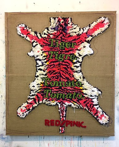
David Kramer, Red Tiger/Pink, 2018, yarn on burlap, 59.5 x 52 inches
(image courtesy the artist)
New York artist, David Kramer looks to the North Star with his exhibition inaugurating Katharine Mulherin’s new gallery in Toronto’s Junction Triangle. Mr. Kramer has long mined the corridors of seventies advertising media and pornography from which much of his work’s imagery is directly appropriated. Digging and sifting for nuggets of an American Dream that once promised his adolescent self a glamorous future of infinite consumption, he has struck a golden vein. The artist has amassed a treasure trove of ad-copy and pictorials brimming with glorious sunsets, beaches, beautiful people, cars, booze and cigarettes. Over the course of his career he has woven this glossy lexicon into a hilariously satirical array of artworks across many media. At Mulherin Toronto, his approach displays no sign of abating. The show is a tour de force of wit and critique dominated by large paintings, but also including shaggy, handcrafted tapestries, and smaller works on paper all of which bear the artist’s trademark pointed running commentary, laced with ironic male anxiety.
Taken together, the assemblage feels a bit like a collection of motivational posters, sodden with themes of neurotic disillusionment. Cleverly composed and energetically executed, they all adhere, individually to the same structural formula. Wistful, often first-person affirmations jingle across vigorously painted pictures, inscribed below with humorous subheadings in smaller print. A good example of this conceit is a painting called Stupid Shit, (2018). The face of a swimming man, his head held aloft while smoking a cigarette is depicted here with his upside-down mirror image glinting in the green of a lagoon. The image is masked by a large red to yellow gradient text reading, “…I have nostalgia for stupid shit.”. Meanwhile, down in the lower right-hand corner of the canvas, where the reflective surface of the water is at its swampiest, floats the money shot in smaller capital letters of frosty blue: “I MISS SMOKING EVERYDAY.”. The surface of this painting is incredibly active. Everything moves, from the water rippling with the implied motions of the man’s submerged limbs, to the ash teetering on the tip of his cigarette, to the contrasting words scrolling over him. The aphorisms themselves, however are deadpan, reinforcing a singular ruefully funny tone and trapping the viewer in a narrative slough of despond. Ba Dump Bump.
At times Kramer seems to redouble his own tactics, creating works referring viewers to others in the exhibition offering the exact same brand of snake oil. A drawing called Shit Show, (2018) from Kramer’s excellent flat file of works on paper, for instance mirrors one of the more commanding of his paintings, entitled Target Audience, (2018). The drawing simply declares “THE CIRCUS IS RUNNING THE CIRCUS.” in bold white Helvetica across a solid black background. Handwritten in pencil below, a single word of understatement, “CLOWNS.” has been crossed through and replaced by a more emphatic addendum, “FUCKING CLOWNS.” The painting, Target Audience re-articulates this content in the lurid visage of a blondish man in clown-face. His smile reveals a set of yellow teeth as he waves his stein of beer in the air. The portrait is again plastered with bulky text, proclaiming “HE WAS A CLOWN’S CLOWN…”. Across the top of the canvas in smaller letters it reads, “ALL THE OTHER CLOWNS LOVED HIS WORK….”. And across the bottom, even more diminutive hand-wrought scrawl whispers the painting’s namesake: “…TARGET AUDIENCE.” We are be-clowned to the left, jokers to the right—between the two works, Kramer’s essence of clown couldn’t get much thicker. This sad-sack stand-up routine very much channels the twittersphere. Replete with its own omnipresent miasma of first world dysfunction and political demise, the chirpy strategy is perhaps too sound—tilting, at times deliriously toward the maudlin, an impression there is not always enough space between works to shrug off.
If, as some say, repetition is a form of change, it is comforting when procedural tweaks throw a flare on the possibility of a broader, more nuanced endgame. In Kramer’s “hook-rug” (sic), Red Tiger/Pink, (2018), we again find preoccupations with image symmetry and textual overstatement but performing in very different ways. In Red Tiger/Pink, the trophy skin of a tiger is compulsively hand-stitched in flaming tufts of wool on raw burlap. Knots of wool form nubby, labor intensive pixels, rendering the Rorschach-like feline image haphazardly pinned securely in place. Further to this idea, a crayon line surrounds the skin like a general boundary of its outermost limit. Wordplay embedded in the stitchery emerges almost as part of it. Yet where the tiger skin holds taut and immovable, Kramer’s words shift toward poetry. In dropping the oft used first person from his narrative, detaching it from the predominant stream of self-referential lament, the artist crafts enigma out of unrelenting schtick. Centered along the imaginary spine of his wooly feline, a text of mossy green edged in black says “Tiger” followed by an emphatic and punctuated “Tigre.”. Lower still on the same spinal axis, the green text reappears, this time reading “Tomato” followed by “Tomato.”. Finally, across the very tip of the tiger’s tail runs an oblique bit of crudely stitched, all capital lettering in red. It says “RED/PINK.”. In sidestepping, ever so slightly, his operational formula, Kramer here allows the appearance of something approaching a Japanese Haiku or perhaps a poem by Gertrude Stein. It’s a down beat in a succession of gotcha moments; a playful reflection on the space between colours, the difference between French and English tigers and the way the word tomato can roll around in one’s mind. Red Tiger/Pink is a cypher, a solid gold nugget of mysterious secret code. Potential meaning glances all over the place, a stand-out in a rather outstanding show.
Jennifer McMackon 2019while-u-wait
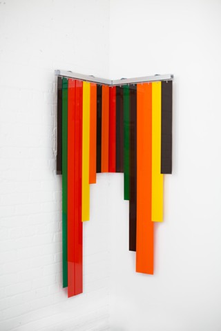
Soft Taco, 2015 by Carlo Cesta image courtesy of the artist
High is low and base is superstructure in Carlo Cesta's unerringly elegant constellation of objects on view at Gallery on Wade. Mindfully culled from the side-streets and corners of the everyday world, they are then transformed by the artist—folded, taped, bent, cropped and carefully coloured—reflecting a preoccupation with the tensions between structure and ornament that have informed his work for most of his career. An unlikely set of nunchucks emerges from what appears to have once been several rolls of brightly coloured and metallic industrial adhesive tape. A few deft folds to a pearlized sheet of paper create a convincing model of a stylish lady's clutch, complete with a delicate rope of chain shoulder strapping. Milk crates are chromed and inlaid with transparent coloured plexiglass in patterns reminiscent of Suprematist paintings. Folding garage doors are cropped—flattened into paintings drenched in colours that simultaneously nod to Reggae music and pure Modernist abstraction. Taco Bell is here too, its iconic corporate interior colour schemes from the seventies incorporated into the deep space of a wall mounted vertical blind sculpture. Metal bars are bent, bathed in automotive finishes and contrived to lean against chromed buckets connoting allusions, for the informed viewer to the work of Anthony Caro, Tony Smith and Charles Ray. The vernacular of the mundane is thus tweaked, coaxed and tailored into a bespoke lexicon offering fluid counterpoint to obdurate Modernist paradigms even as they are revisited.First glance at this deliberately spare, silvery, constellation-like assemblage kindles within it an associative image of something like an experimental molecular model. Each discreet work seems to pivot toward the next held taught by palpable yet invisible filaments. Each point of the scheme appears crucially necessary to the life of the others; each one informing the next and remembering the last. Oddly, there is also a sense that each of the exhibition's individual components is itself prototypical and that each one represents a version of another, or perhaps even many more others like it—interchangeable, waiting and ready to be pressed into service. Lingering on these impressions, relationships between certain of the atelier models develop and crystallize, affording a higher quality of insight into the nature of the prolific Cesta's sculptural lexicon and revealing some of its particular eccentricities.
Consider the two most interventionist works in the exhibition, Inlay (2014) and while-u-wait (2014). These both derive from outdoor experiments in which ubiquitous ready-mades like milk crates and paint buckets finished in commercial veneers find themselves assigned to curb-side parking spots. Customized straight and bent metal rods lean against the crates and buckets like a life size game of pickup sticks. In these circumstances the sculptures function as debonair placeholders, wittily keeping a parking space free for an undisclosed yet preferred vehicle at a future moment in time. In the gallery this reserving function is at a remove and the stand-ins grow less temporary. Losing their makeshift properties, they formalize even as they remain playful—referring as they do, to other works of contemporary art. In Inlay, for example, Cesta embeds the lattice of a shiny silver milk crate with bits of opaque and transparent multi-coloured plexiglass. Lifting the crate off the street and mounting it high on the gallery wall invites ambient light to course through, casting a grid of shadows beyond its cubic volume and revealing an uncannily Suprematist motif. In while-u-wait, a short length of steel rod bent at a ninety degree angle supports another, longer length of the same material resting on the rim of a white bucket appearing to be almost full of white paint. It's a three pronged trompe l'oeil. A dubious feat of precarious balance reminiscent of Anthony Caro's seminal 1962 Early One Morning, it simultaneously alludes to the architectural modularity of certain Tony Smith sculptures and the abject wetness of Charles Ray's Ink box from 1986.
Or take together the two most representational works in the exhibition. Colour Theory Nunchucks (2015) and Clutch (2015). Both are deftly rendered objects but they make an unlikely pair. The riotously colourful nunchucks are as outrageously appointed as the clutch is demure in all white. Even the title of the nunchucks piece, referring as it does to colour theory is overstated. Hilariously, one wonders which theory is in play—Newton, Goethe, Albers? Maybe there is to be a rumble. Are there enough weapons? Meanwhile the clutch is so reserved that speculations about it belong to a different order of enquiry. Is it Jackie O? Or is it more Marylin? Everyday attire? Or special occasion? Who DOES it belong to—did she leave her phone? What else might be inside? What kind of
origami wizardry produces such an attractive paper bag? Not to leave things dangling, but it is not lost on Cesta that both these works represent pendants. A further observation conveys a particular type of pendant, one that is slung over the shoulder and held close to the body, pinned under the arm. From this designated, somewhat concealed position, mad money is protected while ready to spend. And from this position—BAM! Any opponent can be dazzled into retinal submission Bruce Lee style. In the gallery however, the potential functions of these objects are dormant. The giddy nunchucks stream on high from a handily protruding bit of gallery infrastructure. The clutch floats on the wall like a shy jewel suspended from a single pin, neutralized, waiting for a night on the town.But in what sort of night might we find ourselves with our martial arts weaponry and our little purse? A glimmer lies in consideration of the two most formally painterly, minimal and abstract of the works in the exhibition, Soft Taco, (2115) and Armagideon Time, (2014). The surface of Armagideon Time is a cropped folding garage door that has been flattened, its edges finished so as to hang flush with the wall. It consists of three thick horizontal panels of industrial colour—a luminous bar of mustard yellow sandwiched beneath an identical volume of mossy chartreuse and above another stripe of deep rich obsidian black. The painting's stark simplicity and luminosity are relentless. The colour is wonderfully frontal, evoking a memory of Brice Marden's 1971 painting, Rodeo, which is also striking for a weighty band of tar-like blackness comprising the bottom half of its picture plane. This darkness echoes in the title of Cesta's Armagideon Time, a reference to the Reggae artist Willi Williams' 1978 song of hunger, suffering and unrest that was hauntingly covered by The Clash just a year or so later. Against this background of swirling danger the original folding structure of the painting's surface re-emerges. Do we imagine shuttering ourselves safely inside or opening the door up to see out? Retract the door fully or hoist it just a few feet above the ground? In that instance it would be much harder to see into the recess behind the garage door, especially with that dark band of colour obscuring the difference between exterior and interior spaces.
Of course this is the same functional operation belonging to the vertical blind—the jalousie, so named for its ability to conceal the viewer while revealing the vista. These are the same thwarted operations that seem to be on offer in Cesta's Soft Taco. A fringe of chocolate brown and tangerine, red, yellow and forest green plexiglass strips, redolent of a retro Taco Bell trail from a folded, corner-wall situated metal valance. Pull back the blinds and there is nothing but the white wall of the gallery. One is drawn as if into a crevice, lured by the promise of a securely anonymous view only to find oneself in a flat out fictional space ruled by the associative power of beautiful pure colour. Here the binaries of structure and ornament collapse and commingle. Cesta's own subjective, everyday vernacular ripples throughout the exhibition, proving obdurate Modernist paradigms to be the most malleable and elastic of playthings.
Jennifer McMackon, October 2015
The Transitive Nightfall of Diamonds
Coming Apart, Lisa Neighbour 2015 image courtesy of the artist
On the Recent Drawings of Lisa Neighbour
I twist open the lid of a small specimen tin given to me as a souvenir by Lisa Neighbour at the end of a recent visit to her studio. Spilling its contents onto my notes from that day, fifteen tiny, pale green shards of automative glass tumble out like runes. Observing where they fall, I let them rest among the scrawl of my words and doodles on the lined paper. The irregular, pebbly bits lend a changeable topography to my thoughts as recorded there. With the tip of my forefinger I separate them out from each other, herd a few of them inside a thought bubble, punctuate some key phrases with others. Then I gather them up in my fist and toss them again.A meditation such as this connotes the use of a peculiar ouija board capable of generating visual compositions in addition to the voices of spirits. I am unsure what I wish to divine but I persist. Though I don’t have a clear question, I become immersed in an emergent cycle of pattern and image as I continue to animate the glass. I find myself recalling a motorcycle accident at the end of our childhood cul de sac.The details don’t matter. It was horrific for those involved. What I remember distinctly was my view of what came afterwards. A few policemen were placing orange pylons here and there along the road. Another was swishing glass with a broom. It was so hot that day there were vapours of steam emanating from the pavement. I remember at times the men seemed to disappear behind the wisps of steam and the road flashed oily as tar in the sun. I could hear voices but not words. Suddenly, I’m struck by the depth of my engagement, in this quiet reverie. I’m murmuring a little song to myself and I have just the vaguest sense of the lyrics. What is it? The lyrics formulate but without a recognizable tune...shall we go you and I while we can, through the transitive nightfall of diamonds? I’m at home alone, under the light of the computer, lost in a game of sparkly car crash dust.
Ironically, these skittering little curbside gemstones, were born of a noise that was likely rather a lot louder than the sound they make as I push them around the surface of my papers. Implicit in their very geophysical existence is at least the bump of misadventure or worse, a catastrophic kaboom.The traffic rear-enders, deflated dirigibles and shipwrecks depicted in Neighbour’s fledgling series of drawings and screen prints called Smithereens are also post kaboom — sharing a certain distance from the bombast of trauma with their namesake. There are plenty of art historical reverberations too. Consider the booming, speeding, manifestos of Dada and the Futurists. I find myself thinking of Warhol’s images of fatal car accidents and Vija Celmin’s television and disaster paintings. There may even be something a little R. Crumb about these works too, if I think about it — something a little car crash in Peoria. Except wherever Neighbour’s drawings may be set, it’s nowhere near discernable as Peoria.
Each drawing in the series portrays in isolation the skeletal remains of a large demolished vehicle (or two) sagging in the aftermath of a long dissipated thud. An impression of the passage of time is embedded formally in each work as destroyed vehicular prototypes are culled from newspapers and other sources of media. Much of each drawing is then traced by hand through a quasi transparent vellum prior to its development as a screen print, or further articulated as a drawing. This remove lends the images a certain stasis on the picture plane. They seem to float without moving via invisible registration pins, extracted from the landscape and repositioned in the merest suggestion of a ground.
A few of the prints, featuring a particularly distressed and mangled bus are overlain with after-drawing and painting. In two of these, the bus secretes large droplets of dark, sticky blood. Gruesome and a little clumsy, they contribute jarringly interesting compositional elements to the pictures. The droplets are opaque, dark and blobby, suggesting a biological process — possibly something fecund and mushroomy occurring in circumstances it normally could not. Is it a metamorphosis? Comically over-scale in relation to the body of the bus, in Bloody three large drops almost appear to support its weight even as they spill out of it. In another print of the same bus entitled Leaking, Neighbour allows a different sort of liquid to exude from the wreckage. This time it’s something clear and puddly reflecting a pencil drawn mirror image of the bus upside down, a peculiar Rorschach test.The pencil work has a delightfully soft teenage sketchbook quality that is magnified under an acrylic gel medium. A gasoline rainbow seems missing, no, perhaps just barely there in the saline, mirrored bus spill. Or do I desire to see a rainbow where there is none? The drawing makes me double-check. It toys with my line of sight.
These quirky extra layers of imagery with their awkward baubles of ooze disturb the pristine registration of the pathways of Neighbour’s post-traumatic panhandle — pushing the viewer into the realm of conjecture. The nature of these stains in such a select few works is uncertain but it starkly contrasts the lacy dry rot, the uniformly rusty condition of her unwaveringly burned out scenarios. It’s an almost wanton performance yet very specific. Something wet is here. It goes on last, after the tracing is done and the image reproduced. It seems required and necessary. It refracts light. It has weight. It is coloured. It interrupts the tracery, dampening dust and infiltrating structures. Post kaboom, there are still liquids on the planet. What’s left after catastrophic events have passed? An artist reaches for a jar of paint the colour of languished oxygen starved blood....Shall we go, you and I while we can, into the transitive nightfall of diamonds? A risky and exciting new visual lexicon emerges.
Jennifer McMackon, March 2015
You can read this essay and find out more about the work of Lisa Neighbour at YYZSteps to the Studio
Untitled c print, 2010 Jennifer McMackon
A little pad of rainbow-coloured newsprint from the art store makes its way home to my studio. A last minute, must have purchase, it reminds me of the ones Gigi, (my grandmother) used to give us at her house when we were young. “Here,” she would say, “Draw me a picture.”The cover is different, out of sync with the way I remember it. It has the gloss of the contemporary. It is shiny and black and elsewise taken up with mawkish examples of art by “children”. Industrial fuschia bubble letters clown the word “DOODLE” across the bottom of the page. Mildly cloying. The cover says the pages I’m writing on are five inches wide by eight inches in length and that there are ninety-six of them in total. And it says that all purpose coloured newsprint is for crayon, pencil, and cutouts in five different languages. The fresh blank insides of the tablet are better aligned with my memories.
The first page of the pad is the colour of a pale pumpkin and so is the last. Each orange leaf precedes two white pages, followed by one each of yellow, green, pink and finally, powder blue. Then the paper rainbow sequence repeats itself over and over to a thickness of about an inch.
As rainbows go, the doodle pad spectrum is tinted and chalky. Side by side the colours of the pages are so close in value as to be indistinguishable from one another. On the surface of a soap bubble or the scale of a fish, the same colours could exert some iridescent shimmer, some shine. But the paper is texturally analogous to sheets of worn flannelette or mouse ears. Refracting little in the way of light, my rainbow’s capacity for glamour is on par with a dusty, corner store bag of fruit-flavoured marshmallows.
I pull out a pink sheet and tape it to the studio window. It glows backlit against the day, dimming slightly with the passing of clouds and then flaring. A geranium of nearly the same pink blooms nearby. Feline studio mate opens a minty eye, daring me to affix a piece of paper anywhere near his psychic space.
I draw a little map on the pink paper from the window. My grandparents’ house was shaped like an ‘L’. I make a chunky floorplan and lace it with weedy scribbles naming all the usual rooms. Other scratchy marks indicate smells—oven aromas like roast beef, Yorkshire pudding and celery. In summer, there was always the scent of peonies or roses from the garden, in a vase on a table or on the mantelpiece. My grandfather smoked White Owl cigars so an impending headache was in the air too—that, and also more faintly, an ever present commingling of laundry soap and linseed oil.
The soapy, oil of turpentine base note is really all anyone blindfolded would need, to find Gigi’s painting studio at the bottom of the stairs. But I register a couple of interior landmarks on the map all the same—the big oval mirror in the front vestibule and the rosewood grandmother clock across from the kitchen.There were Royal Doulton figurines everywhere, and here’s an X for the bathroom with its frisson of unfamiliar toiletries and towels—its Dixie dispenser full of tiny white paper cups . . .
Two things always gave me pause on the way downstairs. One was the direct view from the landing into Mrs. Hunt’s house next door. Her window was full of turquoise blue Murano glass behind sheer curtains. Once in awhile, though rarely, her drapes parted; that’s how I knew about her beautiful glass. The other reason the landing warranted loitering was a little door in the wall, maybe a foot square with a knobby handle opening into a cubby of about the same depth—like a dumbwaiter but not exactly. This door had a corollary on the outside of the house for the milkman. I could never pass by on the landing without opening that little thing and pushing my hand through to the thrill of the air outside. Though I’d been told more than once it was for milk and the newspaper, I never saw anything inside of it, ever, that I did not expressly put there myself, like one of my dolls or a caramel, or a doodle pad.
Gigi’s painting studio was one of four small, utilitarian rooms clustered at the bottom of the stairs, including a small pantry, a furnace room, and a laundry. It was distinct from each of these in one important way. The door to the painting room was never open. More than that, our instructions were never to open it. It was private.
It didn’t invite. It wasn’t like the pantry full of canned goods under the stairs with the door that was tough to open again if it was not left ajar. It didn’t challenge like the furnace room across the hall with its yawning ductwork and windowless dark that could only be made to recede if I had the courage to grope for the light switch. If I could manage this, I found myself in a reassuringly tidy workroom—walls clad in pegboard and lined with tools. Gigi’s studio wasn’t orderly like that. Nor did it beckon like the sunny next-door laundry room. My grandfather’s clean socks dried on a line strung from one end of the room to the other. Geraniums of all colours grew in pots by the windows, and Gigi had a refrigerator in there too, full of cokes for us to drink.
The door to the painting room was never open. Always closed. It wasn’t for visitors. But I did visit—every chance I got, stealthily sealing myself inside. The light in the studio sifted through sunken window wells and burned, for the most part, greenish gold. Sometimes, leafy shadows animated the walls with grassy, flickering patterns. A Persian carpet covered most of the floor like an ornate mossy island. If I kept to the island, avoiding the noisy linoleum perimeter of the room, no one could ever guess the hours I stole among the airborne dust sparkles examining Gigi’s paintings on their easels. Whoever knew the length of the inspections I performed on the funny points of her pencils which she sharpened with a kitchen knife? Nabob. Chock Full o’ Nuts—I liked to look at her coffee cans full of brushes. Her palettes strewn with knives and squidgy tubes and naked blobs of paint. There were pigment layered, varnish suspensions in jam jars that I muddied whenever I could find an idle paintbrush. Once in awhile I had time to watch my cloudy disturbance reconfigure itself into sanguine bands of distinct hue, time to watch the liquid remember the pattern into which it had once been comfortably ensconced. Sometimes the rings of colour revealed themselves to be merely the residue of solvent long evaporated and my pleasure was thwarted. But I still liked the dried up jars. Their powdery insides recorded time, not in standard units like the clock upstairs but in mysterious coloured rings. Like Gigi’s paintings, they dried on their own schedule, lapsing as they did into the discrete history of the room itself.
Finished paintings leaned two and three deep against one long wall of the studio, mostly with their backs turned so that some careful sorting was involved if I really wanted to look at them. I don’t recall disliking Gigi’s pictures but I didn’t admire them either. I liked some of them better than others. The truth is, they were the least of my interest in the private basement alchemy she practiced. I loved the acrid smell that lingered on my clothes long after I left the room. And I liked to touch the paintings. I liked to poke the raised bits of their deceptively dry looking surfaces—testing, hoping to discover something still wet and malleable— something living underneath.
The other studio wall was taken up by a long bank of closets with pale woodpanelled sliding doors. She kept dozens of old coats and dresses in one of them, all draped in clear plastic from the dry cleaners. There were also rows of old-fashioned shoes and translucent grey boots she called galoshes or, alternatively, rubbers. Sometimes I pulled those floppy boots on over top of my shoes and sloshed around in them as I poked my nose in her things. She had a whole cupboard crammed with wooden stretchers, prepared masonite boards, fancy frames piled up in stacks, and also a couple of big rolls of raw canvas. Some of Gigi’s art supplies had interesting, even beautiful, labels that said Windsor Newton or Reeves or Grumbacher in fancy letters on foil stickers or cellophane wrappers. Heaps of little boxes full of oil paints in fat, pewterish tubes declared themselves to contain elemental things like chromium and manganese and lead. Or else they proffered whimsies: “Hooker’s Green,” “Prussian Blue,” “Burnt Umber” and “Rose”. It was in this corner packed full of science and poetry nearest the studio door, that I discovered Gigi’s immense stash of doodle pads. They were on the floor
inside a big paper shopping bag from Woolworth’s.This essay was published in
simpleposie essays and pictures
Jennifer McMackonDean Baldwin's Cooked Book
Much is said in our time about the intersection of art with public space and the idea of the art gallery that exceeds the limitations of it’s walls. But for Patrick Macaulay, Visual Arts Curator at Harbourfront's York Quay Centre it’s just another day in the life of an institution mandated to make art do just that. Working with a seasonally changing umbrella of themes shared by all of the centre's various organizations, Macaulay is consistently innovative, proactively looking to his community to ensure every nook and cranny under his jurisdiction buzz and sparkle with works of contemporary visual art.
The Cooked Book, Dean Baldwin’s eight channel, asynchronous video presentation (made especially for Harbourfront in tandem with Toronto’s annual Images Festival ) exemplifies Macaulay’s programming acuity. Baldwin’s piece transforms a stroll along the path between the theatre and the gallery into an encounter with what the press release for his exhibition calls “…conglomerate chapters of a dysfunctional whole – part cooking show, part obstacle course, where the process of a meal preparation is continually sabotaged by external tensions”. Housed within a row of eight, square, eye level vitrines, it unfolds a kooky, private series of adventures with food in a space that would otherwise be an absolutely banal corridor.
Baldwin’s videos produce no volume so the coloured light emanating from each piece is accentuated, filling the hall with the promising, magical glow of T.V. Land. Each vitrine proffers a sneak peek at what seems to be a closed circuit, if not secret cooking channel. Each episode depicts delicious food in a continuous state of mostly unorthodox preparation at the hands of an anonymous (Baldwin himself ?), chef. The signifiers are myriad for anyone who has spent a minute in front of the television lately. T.V. Chefs are a cult of personality twenty-four hours a day. Conjuring whole feasts in just minutes with great ease and élan; such individuals impart all manner of adventurous, glamorous savoir faire to cable junkies, would be home entertainers and the hapless hungry alike.
Though Baldwin’s chef/preparateur’s culinary skills seem dubious, they are also winsomely improvisational. This chef shucks oysters on the car dashboard while casually cruising the side streets of downtown Toronto’s West End. Eggs are beaten on the top of a drum kit. Potatoes are peeled in mid air à la Fragonard’s Swinger - their shorn skins dropping like hailstones onto the playground below. And medallions of sliced baguette await juicy dollops of tomatoey topping while spinning on top of a turntable. The vignettes transform simple acts of readying food for consumption into tragicomic feats that are thwarted in each case by peculiar, built in methodology and suspended in the perpetual play of the video loop.
There is a terrific, sideways sensibility in Baldwin’s work that is simultaneously humourous and touching. In one chapter of hisdysfunctional conglomeration, the camera closes in on the chef’s hands, hard at work dicing wedges of fruit with a sharp knife. The grace and rhythm of his actions are disturbed however, by darts which drop like pointy bombs onto the cutting board from a mysterious source on high. A viewer can’t help but wince for the tender flesh of the chef’s ( nimbly dart avoiding) fingers which becomes at least as vulnerable as the fruit he chops so industriously. This feeling is exacerbated as he casually clears the little daggers out of the way so as to continue his work; it is almost as if he gives them back to a hidden dart bomber, setting the hazardous cycle, the siege of droppings in motion once more. In another tableau, a beefier empathy trigger is set on the floor of a racquetball court . Here, over a small wooden cutting board the same hands pound a bright red steak with a meat mallet . In the background, the feet of the court’s solitary player pummel the floor into oblivious submission – racquet swinging - all the while driving a ball against the wall….
My favourite of The Cooked Book’s offerings is presented with a much lighter touch. It begins with cocktails and smoke rings evocative of Christopher Walken’s character in The Continental skits from Saturday Night Live. In this episode Baldwin’s chef steps behind a pasta maker, enacting a drama of entanglement with his necktie and creating a countertop landscape featuring great hunks of lumpen pasta dough. Baldwin articulates all kinds of fraught desires with great economy. This work provokes in me a fleeting association with certain cooking scenes in Kuchar’s Weather Diaries commingled with a judicious sprinkle of old time television slapstick – remember Lucille Ball in the chocolate factory? This piece is ripe with loaded yearning and a delightful, ironic sense of humour.
It is great to see fresh, challenging new video work made specifically for a venue with a wide open public audience and in collaboration with The Images Festival. Macaulay’s habit of exhibiting consistently experimental work - thoughtfully and proactively culled from Toronto’s art community is awesome.
This essay was published in Big Red and Shiny, May 3, 2007
Jennifer McMackonThree Sculptures: Mowry Baden at Diaz Contemporary
To know what our neighbor knows takes some doing. Reading the same newspapers and fitting our bodies to the same machines gives some comfort, but the isolation persists…. people try to explain to one another what happens inside the spectacle and inside their own bodies. This is more than a distraction. On a good day, the machine's authority dwindles. Only the impulse to tell the way through a crisis remains.
-- Mowry Baden in conversation with Stephen Horne
For a few days during the installation period for Mowry Baden’s exhibition at Diaz Contemporary, a mountain of cerulean blue wooden crates, each bearing a white stencil reading " WORKS OF ART " appears inside the gallery's street level garage window, all but completely obstructing the view into the room. This stack of boxes with contents so declared feels sculpturally analogous to a trailer for a movie. Portending the appearance of artworks, it supplants the curiosity of arty passersby with a glimpse that nevertheless maintains all its best kept secrets. Thwarted looky loos will have to wait for the crates to find their way into storage before a peek through the same window reveals the nature of what Baden's exhibition invitation describes matter of factly as Three Sculptures.The works of art, uncrated are assembled into a triangular arrangement of ergonomically scaled floor standing sculptures. Each has the curious appearance of a hybrid form deriving at once from both a space station and a gymnasium. Materially all steel and plastic, with the odd ever so subtly humming, moving part, the sculptures gleam with a kind of retrograde future presence in the powdery white gallery space. There are absolutely no textual instructions or directions as to how these machines of dubious classification might be used or what they might do - confounding for a viewer/onlooker in the stand back and contemplate sense of the word. But a level of persistence in this state of relative uncertainty reveals that there is another, more tactile approach on offer.
One prompted to climb, for example using the toe holds in the conical metal base of Now Iguana, may find himself resting on an armature with a seat for the buttocks plus adjustable rests for the chin and pelvis in a limb dangling moment of suspended elevation. A second point in Baden's tripartite constellation is a piece called Prone Gyres. In this floor hugging work an arm supports a low platform in the shape of a truncated massage table. Operating a bit like a motorized lazy Susan, it allows a viewer to lie prone and use his or her own weight to propel the body through minor whorls of motorized gyres – an experience kindred to a ride on a lily pad engineered for a human being.
The invitation to climb is more pronounced in Baden’s larger and arguably more spectacular Tender Trepanation, which invites the viewer up a short flight of stainless steel steps to a platform where a cushioned, gently torpedo shaped seat scores cyclic patterns in the floor as it maintains its upright balance. Beside this a small table continuously rotates. On the table rests special white plastic tubular headgear - the proposal being to don the visor which is filled with water while sitting in the subtly gyrating chair. This "vision decentering" work proffers a very quiet phenomenal experience - an acute awareness of the spine balancing from the base of the tailbone with hips appended - all the way up to its cranial hinge. Sporting an absolutely beautiful grill of pinkish iridescent hexagons which hold the reflections of onlookers like elegant, gasoline rainbow mirrors to the future, Tender Trepanation also endows the seated viewer with the aspect of the psychic commander of a space deck.
It is an impressive reward, to be transformed via sculpture into nothing more nor less than a limb dangler, a lily pad surfer, the commander of a space deck … and one that doesn’t really lend itself to a mannered or self conscious contemplative step backward. Acting on the impulse to pick such a plum is more challenging for some than others. An artist at the opening tells me she can’t try out any of Baden’s works because, (dressed in a skirt) she is wearing the wrong clothes! Baden’s uniquely imaginative sculptures tinker like an existential thought project with the desire to maintain objective distance from art objects. And this tinkering effectively disputes the safety of that stance, pulling viewers beyond their acquired visual habits, through a state of initial skepticism or uncertainty into a proximity that is more akin to an embrace. In such a space, suppositions as to how to look at works of art and what constitutes sculpture often meet with deposition as the tactility of entrusting one’s weight to a strange armature engenders the awareness of other urgent things like say, balancing, breathing and the sound of one’s own heart beat.
This essay was first published in Big Red and Shiny, October 22, 2006
Jennifer McMackonKatie Bethune Leamen at Toronto's Sculpture Garden
In a minute or two the Caterpillar took the hookah out of its mouth and yawned once or twice, and shook itself. Then it got down off the mushroom, and crawled away in the grass, merely remarking as it went, "One side will make you grow taller, and the other side will make you grow shorter."
"One side of what? The other side of what?" thought Alice to herself.
"Of the mushroom," said the Caterpillar, just as if she had asked it aloud; and in another moment it was out of sight.1
I'm still in mind of the fabled caterpillar's advice to Alice, even as it's been a couple of day's since my visit to the Toronto Sculpture Garden, currently home to Katie Bethune-Leamen's Mushroom Studio. Her gigantic wood, steel and foam toadstool looms some twenty feet over the park which is, after all, an area only forty feet wide, flanked on one side by an old brick wall that is crawling with ivy - and the brisk patio luncheon service of the neighboring restaurant on the other.
Despite its enormous scale, the work has a muted demeanor which stops just shy of making a spectacle of itself. The piece invites attention incrementally. Positioned such that a view from the park's King Street gates exposes an entrance carved in its stalk, a fairly nondescript, industrial door bordered on each side by a little window beckons viewers to approach. Under the mushroom's gilled canopy, screened but conveniently curtainless windows reveal the Mushroom Studio's interior to be a rather austere, partially sky lit studio space.
The room is actually a rounded cubicle. It has the character of a study carrel, with an inset desktop, really, a tableau featuring a lamp and tools such as a a box of prismacolour pencils, a pair of scissors, some glue. In the Sculpture Garden documentation of the piece, there is an Aluminum Group Chair at the desk, lending the studio an air of Mid-Century Modern nostalgic appeal. On the day I visit, however, the chair at the desk is far more banal in terms of its design and condition. There's a little dust buster down below and a portfolio of papers, drawings? Is that Tupac Shakur in that picture tacked to the wall? Sunshine on the glass thwarts viewing just enough to really pique one's curiosity. Through cupped hands one can barely discern a little ink drawing on the wall above the door. The drawing depicts two witches on broomsticks with text that reads, "Props to the Fairy People".
Fairy and pixie connotations abound with this work. One thinks of all the elves and magical creatures in Richard Dadd's Fairy Feller's Master Stroke at home in their very own little mushroom houses. Consider the pontificating slug in the case of Alice in Chapter Five of her well known adventures. The mushroom, a hybrid form of sheltering toxicity, home to fairies, caterpillars and in this case a contemporary artist. This subtext is not lost on Bethune-Leamen suggesting as she does in her statement about the work:
The notion of mushrooms as habitable spaces is a mainstay of fairy tales. In such confabulations, elves or fairies are anthropomorphised elements of the natural world: that which is unseen or unknown is given a form that can be comprehended. In some ways, the contemporary artist occupies a similarly chimera-like social position-both visible and invisible, regarded and disregarded.
An artist's interest in forging a livelihood from their work, and in the case of Mushroom Studio, creating an artwork in which to create more artworks, offers an odd clash of the real and the fanciful.
I'm not completely convinced it's fanciful enough in some ways. I think the architectural features of the studio , its doors and windows could take a little more customization for my taste. The interior could unfurl a bit more - its tableau could be more persuasive. But over all it is wonderfully odd. And it's also brave. And ambitious. It's a rare work that sets as its goal to position fancy in reality. Too often, fancy is ridiculed as frivolity or suppressed. As to the presumption of a clash? Well, there is a marvelous X factor, an aspect of mysterious, untold potential to this piece that will play itself out and take its form in the coming days the artist spends in her most peculiar public residency. The Toronto Sculpture Garden is to be commended on its curation of this project.
[1] - Carroll, Lewis, Alice's Adventures in Wonderland, Random House New York, 1946 pp 49.
This review was first published in Big Red and Shiny, July 13, 2008Scenes for my Affection: Sandra Meigs at Susan Hobbs Gallery
Sandra Meigs' exhibition at Susan Hobbs Gallery is called Scenes for My Affection. In the main gallery the artist presents two clusters of small colourful paintings. The first is an untitled set of three, each of which has a neon "dummy" or funny face embedded in a mise en scene, creating an electric double entendre. The second family of six works entitled, Scenes for My Affection, initially appears as an arrangement of monochromes - an impression that disintegrates as one draws closer, discovering imaginary, interior realms etched into the colour fields of the individual painting surfaces and encountering protruding elements such as transparent glass globes and droopy, disconnected plastic tubing.
Most of these works are "framed" with flimsy ribbons of coloured theatrical lighting gel or silvery reflective mylar . These somewhat debased materials simultaneously refract and contain light, both within and without the surfaces of Meigs' paintings so that they seem to sparkle or wink. These ersatz framing devices conjure an array of ocular associations, their kitsch sparkle falling on a spectrum somewhere between memories of shifting, disco party light and the hollow glow of a rabbit's eyes caught in late night highbeams. Somehow the frames lend the paintings the uncanny air they are viewing spectators in as much as they are also on view.
But it's not just the frames. Glassy orbs seem to bubble like eyeballs out of many of the Mattisse like interiors of the Scenes for My Affection series. Some also feature dangling clear plastic tubing, suggesting strange and private circulatory systems that have somehow become severed from the faint contours of a courtroom or a pool hall, among Meigs' depicted tableaux. Or consider the Untitled 2006 work pictured here. One can see the image trapped inside a fence of orange gel. A crude horizon is implied by washy beige brushwork and stronger, orange squiggles indicate a cartoonish psychic force field. A female figure, completely enshrouded in a red cloak but for a bit of leg and green socks buries her face in the arms of a comfy chair. Or is that so? Because in the folds of the cloak are inserted three neon lights as slim and bright as matches. Two cold white electrical eyes and a mouth poke right through the foreground of the painting. A rudimentary face, like a blinkenlight person staring and blank seems to ask with inflected English, "Are you looking at me?"
Meigs' paintings often pose this enigmatic question . What are we looking at? Elements of bitter paradox have long resided at the core of her work. The Scab Picker, an enormous 1984 mural at the ( now closed) Ydessa Hendeles Gallery, depicted a beautiful pastoral landscape incised with a doorway, through which could be glimpsed a portrait of a hideous mountain troll toying with a cut on his knee. Ten years ago at Vancouver's Contemporary Art Gallery, another series, Dummies, collapsed landscape into portrait in a fantastic and surreally excessive exploration of the grotesque and abstraction. Since then, Meigs' dummy portraits have simplified and multiplied in installations such as Joy Joy Sorrow (1999). And they've shown up in chalky surfaces of minimal colour field explorations like Donor, Green (2006).
The works in Scenes for My Affection demure to this history and at the same time they throb with it. Susan Hobbs' upstairs space is dominated by a single huge painting. The piece, entitled What The Inside Sees, is rendered in an abbreviated scale of perhaps two, maybe three grays and a white. The scratched contours of the works downstairs become much more luminous in this painting at larger scale. Depicted is a rather grand staircase in a foyer in which two big rabbits and a small dog form a listless committee. The scenario has the aura of abandonment, a place usurped by half light and leaves, like Miss Havisham's House in Dickens' Great Expectations. It appears too, to have been overcome by an army of ghosts. It is swimming with Meigs' trademark blank, staring faces. There is no way to view this painting outside of their notice, embedded as they are, in nearly every surface of the room. Their visages even inhabit the air between the spindles of the staircase banister . There are also two hilarious eyeballs resting on the room's key table! What The Inside Sees transforms the singular question, "Are you looking at me?" into a choral arrangement. And it does sing.
It's only a minor disappointment, but I wish there were a few more of these large paintings in Scenes for My Affection. What The Inside Sees is so fearless and so much fun, one can only hope Sandra Meigs has more like it on the go in her studio in Victoria, British Columbia. This is an extremely rewarding, if slightly transitional exhibition by a painter who really pushes the envelope.
This review was originally published in Big Red and Shiny, December 3, 2007A Studio Visit with Carlo Cesta
A late afternoon light sifts through a grid of east facing windows revealing the warehouse studio of Carlo Cesta to be a room full of metals. All the utilitarian, shades of silver and grey, iron and aluminum find representation in this space. Ubiquitous overhead vents, sprinkler pipes and clunky, floor hugging radiators go with the territory of a light industrial studio. An assortment of blackened metal jigs strewn on a work table, and a bucket of bending rods down below suggest the industry goes far beyond the architecture. Because the room is full of other metals too - ones that have been bent and cut and welded by the artist into all manner of shapes, angles and curlicues. The work stands in various states of assemblage and chromatic patina, forming a sculptural thicket in the middle of the room that is simultaneously Baroque and Judd-like.
"How do you like my wine rack?", Cesta asks me, holding up a kitschy metal lattice for about eight bottles of plonk. "I found it up the street." Apparently the work in progress I've come to see has considerably eclipsed the scale of its template, standing a good yard over the top of my head. There is no way to step back and get a view. This piece, comprised of rows of stacked wine racks, resounds with a memory I have of a much earlier work at the Toronto Sculpture Garden . This artist is a master at coaxing iron rods into life size, transparent, cubic volumes, connoting with no slight degree of emblematic luxury, things mundane and familiar. The piece I'm looking at, (actually standing in the midst of) is still an infant. Cesta tells me it is soon to be chrome plated and likely topped with a garage door in abutment with a gallery wall.
It's exciting to look at art in this stage of production and two things cross my mind as Cesta and I converse. One is the fantastic amount of sheer labor required to make these structures that take their formal place in the world so effortlessly. It's so easy not to think about material and the actual way things are made. Seeing the emergence of such a piece in the studio is interesting because I know that in the end it will, to some extent belie the fact of its manufacture. It will become all pattern, surface and refracted light, a highly efficacious illusion even in its solidity and objecthood.
Second, though his work was recently shown here last spring in an exhibit organized by the Hart House Installation Collective at The University of Toronto's St. George Campus, Cesta has, more often than not been exhibiting out of town. A show at Hallwalls, a residency at the Banff Center for the Arts , recent inclusion in the massive endeavor that was Beyond in Western New York and exhibitions (most notably in Paris) with the collective, Persona Volare have all meant we haven't seen as much of his work in Toronto lately. So it is with some anticipation I behold this baby winerack as it will be part of an upcoming solo exhibition at Diaz Contemporary. We look at variations on its design in the form of schematic drawings. Various works are proposed as companions. He tosses around a couple of potential titles and they're all witty as Hell. They should be because the idea of a garage door perched on top of a wine rack is pretty funny. Don't you think?
Cesta's works are often entitled in good humour. Sometimes, it is bald faced directness that renders the smile. Mellow Drama -Sandwich Board illustrates this to a tee. I can only imagine the luncheon fare signified by this wrought iron grill. And of course that's the point. Often, Cesta's titles allude to relations between base (materials) and decoration (ideology). A white garage door, emblazoned with a beautiful Italianate flourish of shiny silver aluminum tape is called Decorated Shed (2005) - no doubt in reference to Robert Venturi's Learning From Las Vegas. Even without the allusion, the piece screams haute lowbrow or should I say bas-bas highbrow? Regardless, an implicit economy is registered. In almost every case, decorous solemnity and giddy empathy commingle in equal measure.
The afternoon comes to an end as the light bath from outside starts to fade and the lustrous sheen on all the metal objects in the studio recedes. So many plans unfolding – information exchanged - wheels turning. How deluxe to pause for an hour or two in Cesta's factory, where dense metals are bent, fused and rendered compliant, emerging almost alchemically as new forms that are lighter than air.
This essay was orignally published for Big Red and Shiny March 25, 2007
Reviews, Critiques and Catalogue Essays
If you would like to hire me to write about your work, please do get in touch.Rates:
Initial studio visit and consultation, $100.00 payable day of visit
An essay of one thousand words, $500.00 payable upon completion
An essay of two thousand words, $1200.00 payable upon completion
If the writing you require is for an institution, we will go with their rates